Five Years of IBC and the Evolution of a Leaf
Posted 12th September 2024
Today, International Biodiversity Consultants Ltd (IBC) is turning 5 years old.
To celebrate this milestone, we decided to press the Refresh Button and therefore took on the project of designing a brand new company logo and developing a more coherent brand identity for IBC that reflects our existing work, mission, values, and our relationship with our Clients.
Humble beginnings
As is the case with most small and medium start-up companies, the process of identifying a suitable logo was rather challenging when we launched the business, especially without the graphic design and branding expertise and the budget to hire a designer. Nonetheless, we put a great deal of research and thought into our brand identity. When we found the leaf logo, we concluded that it was the right choice for our business, along with the combination of dark and light green as our branding colours and the “Diavolo” typeface for our logo wordmark.
First signs of change
Between 2021 and 2022, we developed IBC’s existing website further conceptualizing a business services model and a working approach and methodology that emphasizes IBC’s vision, mission, and values putting at the centre Biodiversity, People & Society, and Business Processes.
However, in the following years since the launch of the new website, IBC’s Directors observed an increase in other organizations that started using a similar type of logo and brand identity as IBC. A development that is not desirable when a small business is trying to stand out and be noticed!
During that same period, IBC’s Co-Founder Tanja Rogers developed a passion for graphic design and digital art, and learned a great deal about logo design, branding colours and typography, layout composition and many other design aspects; something she utilized in all areas of our business including social media campaigns. It therefore seemed only fitting that these new skills would be assigned to take on the company rebranding project.
The shapes that define us
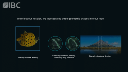
Thoughts went into what shapes the new logo should be made up of and how they would represent the company:
- – Square: Stability, structure, and reliability
- – Circle: Continuity, wholeness, harmony, community, unity, and protection
- – Triangle: Strength, robustness, direction
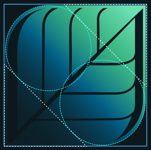
It quickly became apparent that IBC’s working philosophy, mission, and values could be found in all three geometrical shapes:
- – Square: We apply structured approaches and methodologies to ensure that organisations are enabled to make informed decisions for nature and biodiversity based on stable data models and reliable data outputs
- – Circles: Our Team strives to provide solutions by making connections between seemingly unrelated occurrences based on scientific assessments and data analyses. This presents our Clients with a complete picture and ensures continuity of both their operations and the protection of nature and biodiversity.
- – Triangles: The triangles inside our logo are pointing in a forward direction from bottom left to top right to symbolize IBC’s continuous drive for nature-based progress and our approach of utilizing robust and state-of-the-art methods in our project work.
The way forward
As IBC begins this next chapter of our journey and endeavours, we look forward to what the next five years will hold for us and our work in supporting our Clients achieve their nature and biodiversity goals.
Following the launch of our new logo, we
- – are working on giving our website a new look that will match with our new branding colours;
- – are developing an additional page dedicated to our new conservation service, which is embedded within our other three core services; Biodiversity, People & Society, and Business Processes; and
- – continue to extend our network of experts and fields of expertise worldwide.
So, watch this space over the coming months!


